

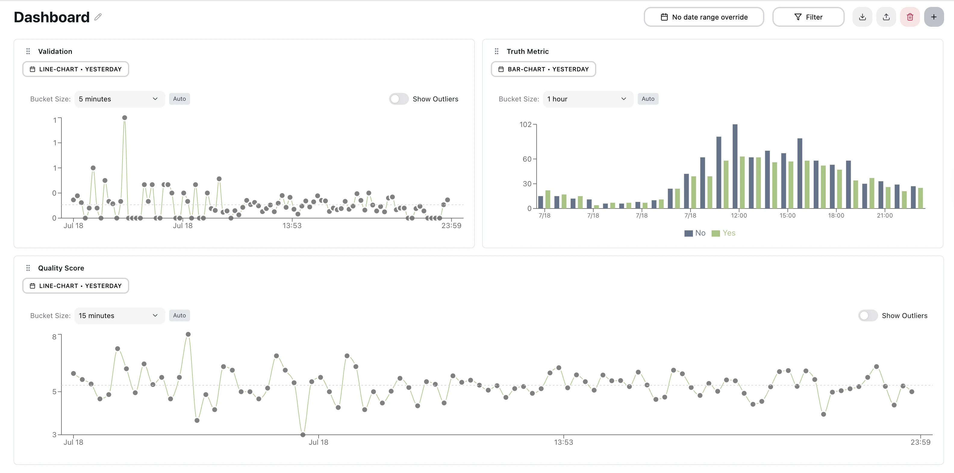
Building a dashboard
- Open Dashboards from the sidebar. You can keep several dashboards and switch between them.
- Add a widget and choose the metric it should display.
- Pick a widget type and a calculation, and optionally compare by agent, persona, or another dimension.
- Apply filters and a date range to scope the data.
- Arrange widgets on the grid — they resize and save automatically.
Widget types
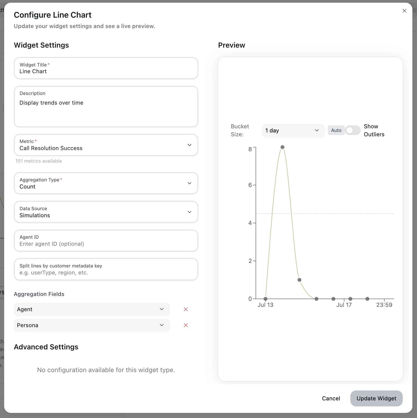
A few options worth knowing: Area and bar charts support drag-to-zoom; Number renders one card per group when you compare by agent, persona, or another dimension; yes/no metrics are colored automatically; and histograms drop outliers (beyond the interquartile fences) so a few extreme values don’t skew the bins. If the metric has a threshold, the Targets section lets a line chart shade a target zone and a bar chart draw a threshold line. Line charts using the Average calculation can also show baseline bands from a metric baseline.
Filtering and analysis
Calculations
Each widget has a Calculation selector that sets how results are aggregated. Numeric metrics offer Average, Sum, Count, Maximum, Minimum, P90, P95, and P99; string metrics offer Count and Success Rate. Bar charts and tables use Count or Success Rate, and pie charts always count. The Number widget adds a Decimal Places setting (0–3) and an optional units label.Grouping
Use Compare by to split a widget by agent, persona, agent mutation, template, test set, or a metadata key. Binary metrics get automatic yes/no breakdowns. Under Limit to, restrict the widget to specific agents, agent mutations, personas, templates, tags, test sets, or test cases.Date ranges
Set a date range per widget, or apply one across all widgets at once. Presets include Today, Yesterday, and Last 1, 3, 7, 14, or 30 days, plus a custom fixed range, “In the last N days/weeks/months”, and “From custom date until now”. A range can span up to two years. Line, area, and bar-over-time widgets have a Time grouping selector that sets the bucket size: 15 minutes, 1 hour, 4 hours (the default), or 1 day. Bucket boundaries follow your timezone.Series display
In the widget editor preview, the legend is interactive: click a series to hide it and click the dimmed entry again to show it (keyboard and touch work too). Hidden series are saved with the widget — Save changes keeps them and Cancel discards them — and the Visible groups section lists every series so you can restore any you’ve hidden. Under Customize display, assign a custom color to each series; it applies to both the chart and the legend swatch.Metadata filters
Filter dashboard data by custom metadata attached to your simulated or uploaded conversations — customer tier, campaign ID, region, experiment variant, and so on.Metadata filters work with any key-value pairs you’ve included in your
simulation or conversation data. Values are matched exactly, and multiple
filters are combined with AND logic.
Test case filters
Filter to specific test cases to isolate performance on a subset of scenarios. Combine with agent, persona, and metadata filters for precise segmentation — useful for regression tracking on a fixed set of canonical inputs.Drilling in
Focus mode
Click any data point for a full-screen view: the chart on the left, the detailed run data on the right.Run details
Drill from an aggregate chart down to the individual calls behind a data point. See exactly which calls contributed to each number and investigate outliers at the source.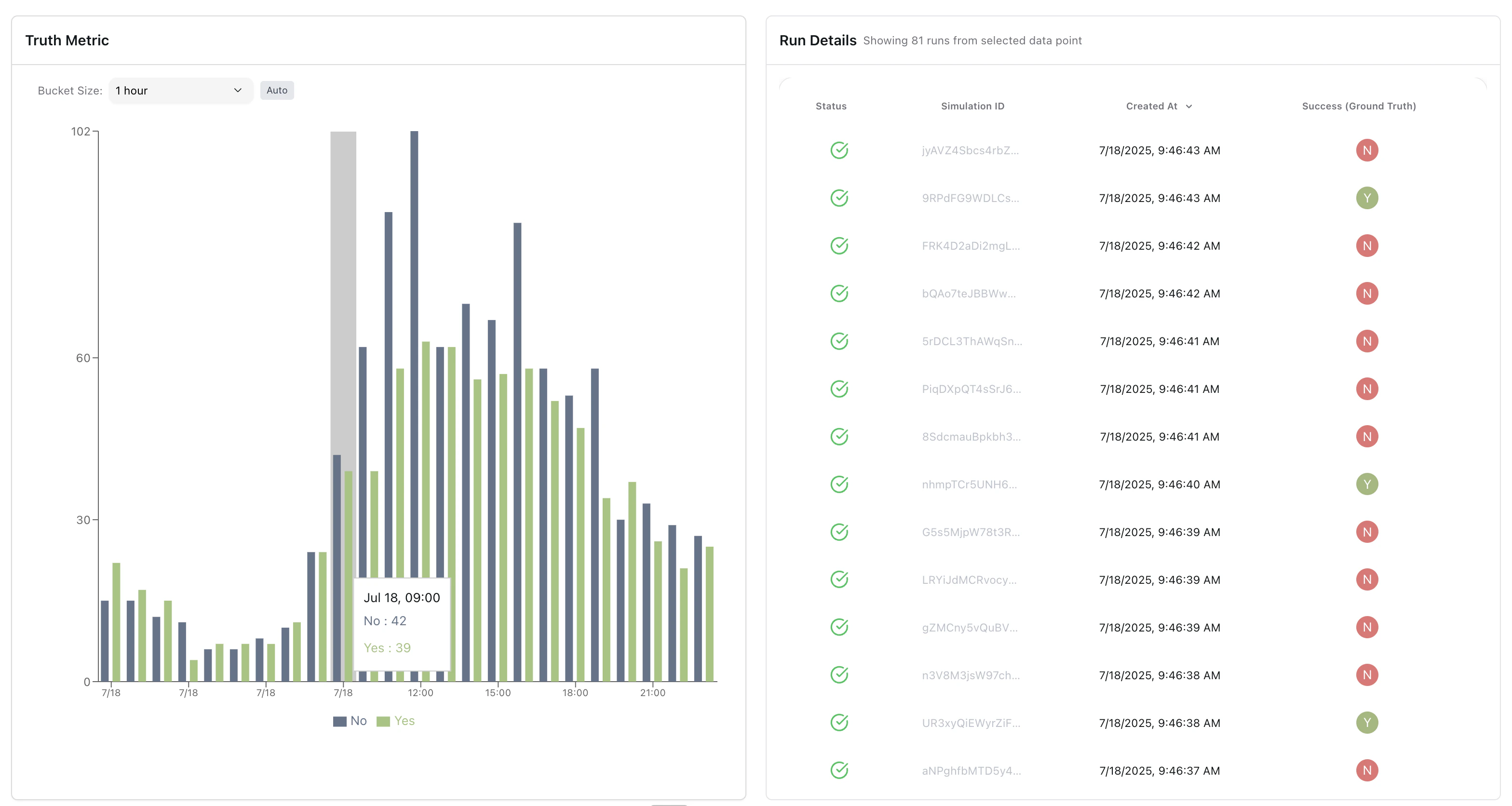
CSV export
There are two exports:- Widget data — open the widget actions menu and choose Download CSV. The file starts with a header block (widget, metric, aggregation, data source, bucket interval, date range, timezone, split-by dimension, and whether filters were applied), followed by the data. Time buckets are written as
yyyy-MM-dd HH:mm:ssin the timezone named in the header; whole-range totals and histogram bins keep their labels. - Drill-down rows — export from the run details panel. The file includes all visible columns, including metric values, timestamps, and run metadata.
Alerts from a widget
Create an alert straight from any metric widget, without leaving the dashboard. Open the widget actions menu, choose Alert, and set:- Alert Name — a label for the alert.
- Condition — the comparison (greater than, greater than or equal, less than, less than or equal, or equal to) and the value that triggers it.
- Scope — apply it to uploaded conversations, simulated conversations, or both.